
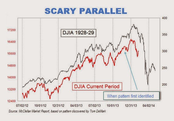
 The above market chart superimposes the 17 months of the DOW Jones as it led up to the 1929 market crash, our most recent 17 months (Feb/2014). The implication? Get the heck out of dodge because the market’s about to crash!
 Have you ever noticed that we’re always about to enter the next great depression? That we’re ever on the verge of a currency collapse? Or that food shortages and massive civil unrest are just a few ticks away? Better start buying guns, ammo, water, freeze-dried foods and stock up on your gold bullion! I never really understood the benefit of having a safe lined with gold during periods of anarchy and societal upheaval. It might be an inflation hedge but it’s not all that nutritious. 🙂 But I digress.
More false dire predictions from John Paul Jackson
Is this “scary parallel” really a reliable indicator warning us of an impending epic tidal wave? Is it really that simple to predict the future? If it’s that easy, why bother with all the technical analyses and all the financial mumbo-jumbo just scour these mountain charts and begin predicting away! It’s as easy as 1-2-3. And you thought the amazing Ronco slicer/dicer was cool!
Ever wonder why the chartster who first recognized this “frightening” similarity, used this particular 17 month time frame? Why not compare the period 24 or 36 months prior to the 1929 precipitous drop? What’s so magical about 17 months? Could it be because the comparisons wouldn’t have been as startlingly similar? Inquiring minds wanna know.
So before jumping off the bridge or cashing in your equities, let’s interject a little common sense into the equation. Consider the following analogy:
Johnny Jones just had a massive, fatal heart attack. Johnny was a 53 year 5’11”, 180lb white male, with a body mass index of 26 and body fat ratio of 20%. All pretty average numbers. So, from this can we successfully predict that every 50-55 year old man with similar stats, is about to die of heart failure? Why not?
Because we haven’t taken into consideration ANY of the vital internal factors that may have contributed to this man’s demise. Did he have coronary artery disease or a heart defect? How about diabetes? Was his blood pressure abnormally high? Did he routinely get too little sleep? Was he under severe job pressures? How about his relationships? Did he exercise regularly?
These kinds of underlying issues are at the heart of the matter. 🙂 So, in comparison, by using one market chart to make predictions, what have we effectively done? We have ignored all the vital factors surrounding the market. Interest rates. P/E ratios. Liquidity. Inflation. Debt ratios. Economic outlook. Legislative climate. Tax policy. Investor sentiment. Fundamentals. Earning growth or decline.
So which of these many factors are known by simply looking at the above market graph? NONE! And that’s the point.
Could we be entering shark infested market waters? Sure, it’s possible, but without considering ALL these factors, I’m simply questioning the prudence of using one chart to predict a massive stock market collapse. Investor sentiment could clearly be negatively affected by this sort of headline, but unless we’re shorting the market hoping for a self-fulfilling prophecy, doesn’t this kind of one-note-wonder decision-making, seems rather simpleminded?
Not only do I believe it’s not prudent but, I think these kinds of headlines are just plain irresponsible. And it surely causes one to wonder what would motivate a long time industry analyst to make such an outrageous insinuation? This chap wrote, “The picture isn’t pretty. And it’s not as easy as you might think to wriggle out from underneath the bearish significance of this chart.“
Oh really? “Bearish significance” of a time manipulated chart that just so happens to coincide so perfectly? Come on now. All that can be read into one chart with no regard to the zillions of other factors? Something smells rather wharf-like. And given the fact that this 1929 scare piece is still the top story at www.Marketwatch.com, proves that sensationalism sells.
Listen I can’t look into this man’s heart. I don’t know what his motivations are. All I know is that some people are doing everything in their power to sell newsletters, doomsday kits, precious metals and freeze-dried apples. Just because it may prove financially rewarding to shock the world, it seems rather disingenuous to me.
This market may in fact soon be rushed by ambulance to the ER, but chances are that this “scary parallel” won’t have proved to be all that predictive. This internet driven 24/7 information age, is wonderful in many regards, but it can also seriously skew our outlook. I believe that if we don’t begin to temper or even mute the constant drum beat of doom by these fear mongers, we’re all going to be prime candidates for a myocardial infarction! Obviously it’s not healthy to ignore pessimistic data, but it’s the kind of information that’s used to predict declines that is important. And this, in my view, is not it. Not alone anyway.
In closing, let me make clear that I’m not in the least suggesting that you buy, sell or hold. Just don’t be frightened by a single, time-manipulated chart. Perhaps a little prudence is in order.